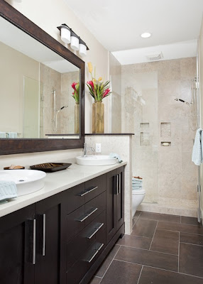
Our bathroom remodel is finally coming together in my mind. FINALLY. Which is a good thing, because for a long time I couldn't quite picture it and was constantly worried that it wouldn't look good. Now I am only sometimes worried that it might not look good. It would have been so much easier if I had just found a picture of the perfect bathroom (cuz I have found a picture of the perfect living room, and lots of pictures of the perfect kitchen), and we could have copied it, but though I looked and looked and looked and LOOKED at pictures of bathrooms, the right one still eluded me. So we finally decided to just pick some tile we liked and work from there.
We went to Contempo, even though they are expensive, cuz I already knew they didn't have any tile we liked in stock at Lowes or Home Depot. And they have lots of tile that is GORGEOUS, but we had kind of decided we wanted something in the dark gray family. And then we fell in love with this:
and the picture is ridiculous. it is just a blurry bunch of gray slop, but in person, I was drooling. I looks like a sheet of metal. At only $19 a square foot. Which is also ridiculous. We have agreed that we don't just want to get whatever is cheapest, we want to really love it, and if that means spending more, so be it. Just not THAT much more. We have to somehow find a balance between what we really like and the price we are willing to pay. Long story short, we kept looking.
Then we found this:
Hmm, nope, can't find a picture. But it was sort of similarish for only $2.95 a square foot. And comes in 18x18 tiles. So, after lots of time and thought and looking around some more, I think that is the one we are going with.
We're going to cut the tile into skinny strips and do something like this in the shower:
and then cut the tiles in half to do something like this on the floor:
I guess that is actually a herringbone pattern. Whatever.
So then we went to Ikea to pick out a vanity. Vanity cabinets are expensive. Especially for something 60" wide, which is what we need. I was having a hard time finding a cabinet and countertop for less than $1000. And I just really don't want to pay that much. Really. So I figured we could convert a dresser into a vanity for cheaper than that, and I looked on KSL for months, but anything I found that was big enough was in Salt Lake or further away, and none of them seemed perfect and cheap enough to make a trip all the way to Salt Lake just to see if maybe it would work. So Ikea it was. I had my eye on this one:
and then Richard decided he liked it in blue, and I was more than happy to get on board with that.
Maybe it will look sort of like this? (And yes, we should have a tiny shelf along the bottom edge of the mirror like that.)
cuz yeah, a nice white marble countertop is just what I want. I've looked for marble slabs, but those aren't cheap either. Richard thought for a while about doing a concrete countertop, but decided that would be more fun in the summer.
Laminate seemed like the way to go. I don't mind laminate. I am always a fan of a good, cheap knock off, and laminate falls right into that category. And then, today I found that you can buy laminate sheets from Lowes in any style we want, for under $100, I got VERY EXCITED.
I'm thinking Carrara,
or Calcutta
I might prefer the Calcutta, but the Carrara is about $40 cheaper. Yes, yes, it is all coming together. But what really made the difference was when I saw this picture:
Then the final pieces fell into place. Because I knew. That is my bathroom. Of course some of it is wrong, like the sink and the floor, but it is still the one.
Dark tile floor, white wainscot, gray wallpaper, dark blue accents, and maybe a little orange, just for fun.
Here are a couple others that have led me down the right path:
Our shower to be:
The basic view of our vanity. Only the colors are wrong.
The above picture even inspired us to use pendant lights as our vanity lighting. I really like those exact ones, but Richard didn't so we found something else we both like. Which came in a pack of 3 for $40. Can't beat that!
And here is another bathroom with wallpaper. Wrong colors, RIGHT STYLES. Oh, so right.
That is the wainscot I want. So simple, yet so elegant. And instead of wallpaper, I'm going to stencil the top half of the wall, kinda like this:
Awesome. Finding the right wallpaper was getting pretty difficult anyway. So this way, we get exactly what we want AND save money, which is the whole point.


